Designing mobile apps is not just about how they look — it’s about how they feel and function.
At Rodekontov, we’ve built apps for both Android and iOS, and we know one thing for sure: a great user experience on iOS can feel broken on Android — and vice versa.
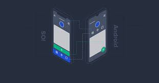
Here’s why UX design must be tailored to each platform.
📱 Navigation Patterns Are Different
- iOS uses a bottom tab bar and swipe gestures.
- Android often uses a navigation drawer, floating action buttons (FAB), and system back buttons.
Why it matters: iOS users expect “Back” to be in the top-left corner. Android users instinctively hit the hardware back button. If your app ignores that, it frustrates them.
🧩 Platform Guidelines Define Behavior
- Apple’s Human Interface Guidelines and Google’s Material Design are not just decoration—they guide logic, spacing, interactions, and accessibility.
- iOS prefers blur effects, rounded corners, and minimal icons.
- Android focuses on bold colors, shadows, and floating actions.
Mistake to avoid: Copy-pasting one design from iOS to Android will confuse Android users — and vice versa.
🧠 System Fonts and Gestures Differ
- Fonts: San Francisco (iOS) vs. Roboto (Android).
- Gestures: iOS uses swipe-from-edge; Android allows swipe-anywhere.
- Keyboard behavior, spacing, and even scroll physics differ subtly between the platforms.
Pro tip: These micro-details affect perceived quality. Native-feeling apps get higher ratings.
🛠️ Component Availability
- iOS has built-in modals, date pickers, and segmented controls that behave a certain way.
- Android uses Material Components and bottom sheets instead.
Smart design means using native components when possible to improve speed, familiarity, and OS updates.
🎨 Our Approach at Rodekontov
We don’t use “one-size-fits-all” design. Instead:
- We build a core UX logic that works for both platforms.
- Then we customize the UI per OS to match platform behavior and user expectations.
- We often use Flutter for shared code but platform-specific UI logic when needed.
This approach ensures: ✅ Fewer user complaints
✅ Better app store ratings
✅ Higher retention rates
Final Thoughts
Designing for both platforms doesn’t mean duplicating everything.
It means understanding user expectations, system conventions, and the psychology of motion, touch, and flow.
At Rodekontov, we make sure every swipe, button, and screen feels like it belongs — whether on iPhone or Android.
No responses yet